Home > Website Builders > ScreenSize.net

ScreenSize.net Verified
Live screen checker for responsive web development
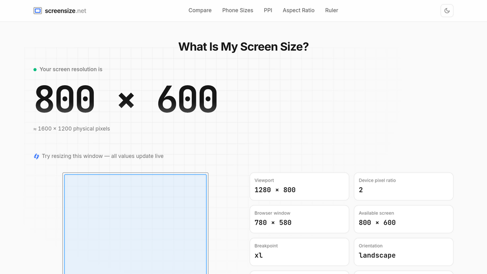
Screenshot of screensize.netOpen website ↗
About this tool
ScreenSize.net is a live screen checker that shows your current viewport dimensions, screen resolution, device pixel ratio, and other specs in real-time — no DevTools needed.
Perfect for:
• Testing responsive breakpoints as you resize
• Sharing exact screen specs with clients or designers
• Quick reference on mobile devices (where DevTools isn't available)
• Comparing your screen with target devices (iPhone, iPad, MacBook, etc.)
Related tools

Makedraft
Generate HTML templates from text prompts

Alpac.App
The fastest and most flexible website builder there is!

BoilerplateHunt
Find the Best Boilerplates to Ship Faster

StarSymbols
Star Copy and Paste - All Star Symbols

NuxtPro
The NuxtJS boilerplate with all the stuff you need to get your product in front of customers

Metakit
Content that writes itself. Sites that stay healthy. Graphics that ship on-brand.
Submit your Tool
Publish your website on Twelve.Tools and get a DR 83 dofollow backlink to boost your SEO
Submit NowFrogDR
Monitor your Domain Rating